Fixing the design of the UI:
Why fixing? What's broken? Well run your application in either the simulator or on your device, and then rotate into landscape orientation. Tip: You can rotate your simulator by going to Hardware->Rotate Left in the simulator menu (not the Xcode menu). Indeed, there maybe issues with the portrait orientation as well if you run your application on a device with a smaller screen to the one you have been testing on so far. We need to follow a process of constraining the UI elements to specific distances with respect to themselves and the screen's edges.
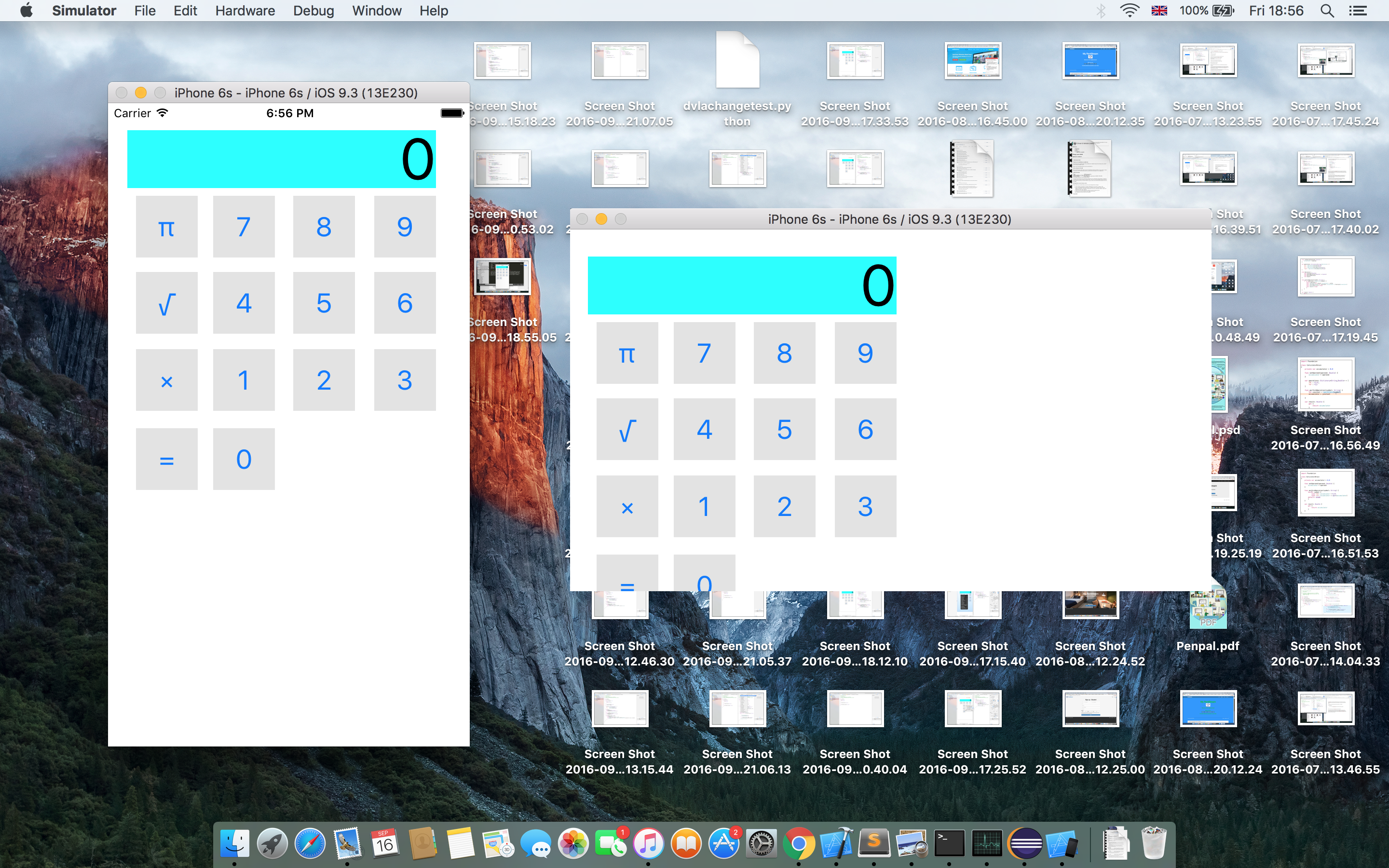 Figure 1: Broken UI - buttons do not fit on screen.
Essentially by the end we will have designed a UI that will reallocate the space appropriately for all the UI elements based on the screen size and orientation of the device. This will ensure, for example, that there is non white space when the device is in portrait or landscape orientation. The way to do this is through using stacks.
This is the order in which we will proceed:
- Create a horizontal stack per row of buttons.
- Create a vertical stack of these horizontal stacks.
- Create a stack for the vertical stack and the display.
Select the Main.storyboard file. To create a stack we need to first select all the elements that will be in the stack, so begin by selecting all the buttons in the bottom row. Then go to the menu and select Editor->Embed In->Stack View. This will modify the look of these buttons, and at first it may look wrong. However, we are yet to add our constraints to the stack, and this can be done through the inspector window - as seen in Figure 2.
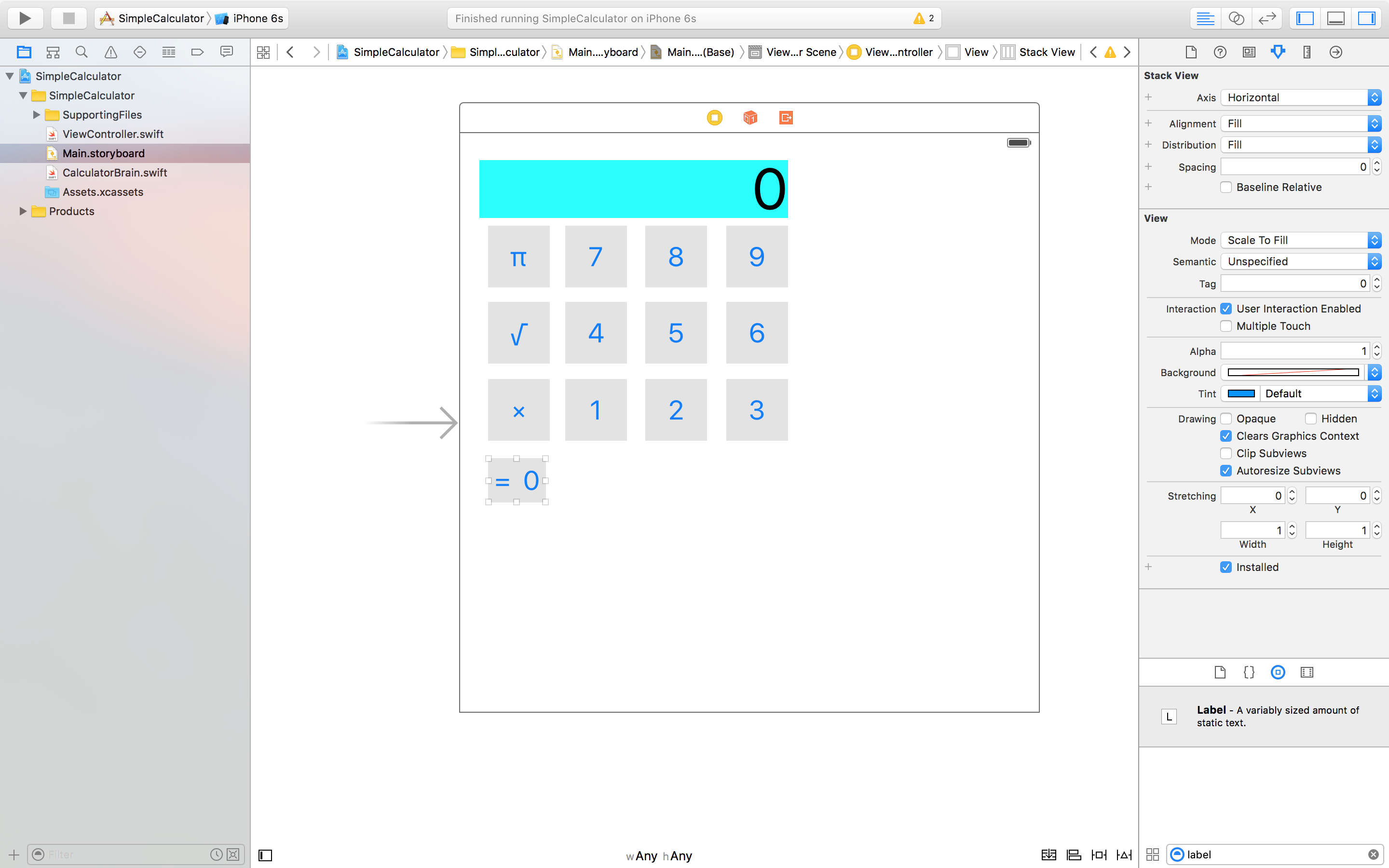 Figure 2: Creating our first stack view.
First we will adjust the spacing between the buttons in this stack by changing the spacing value to 10 (instead of the current value of 0). This will automatically update the storyboard. We will also change the distribution property to "Fill Equally" this will mean that the '=' button and '0' will have the same width in this stack. Repeat this for the other rows of buttons that you have in your calculator. You should end up with something like Figure 3. Note: The 'Axis' property for these stacks are all horizontal.
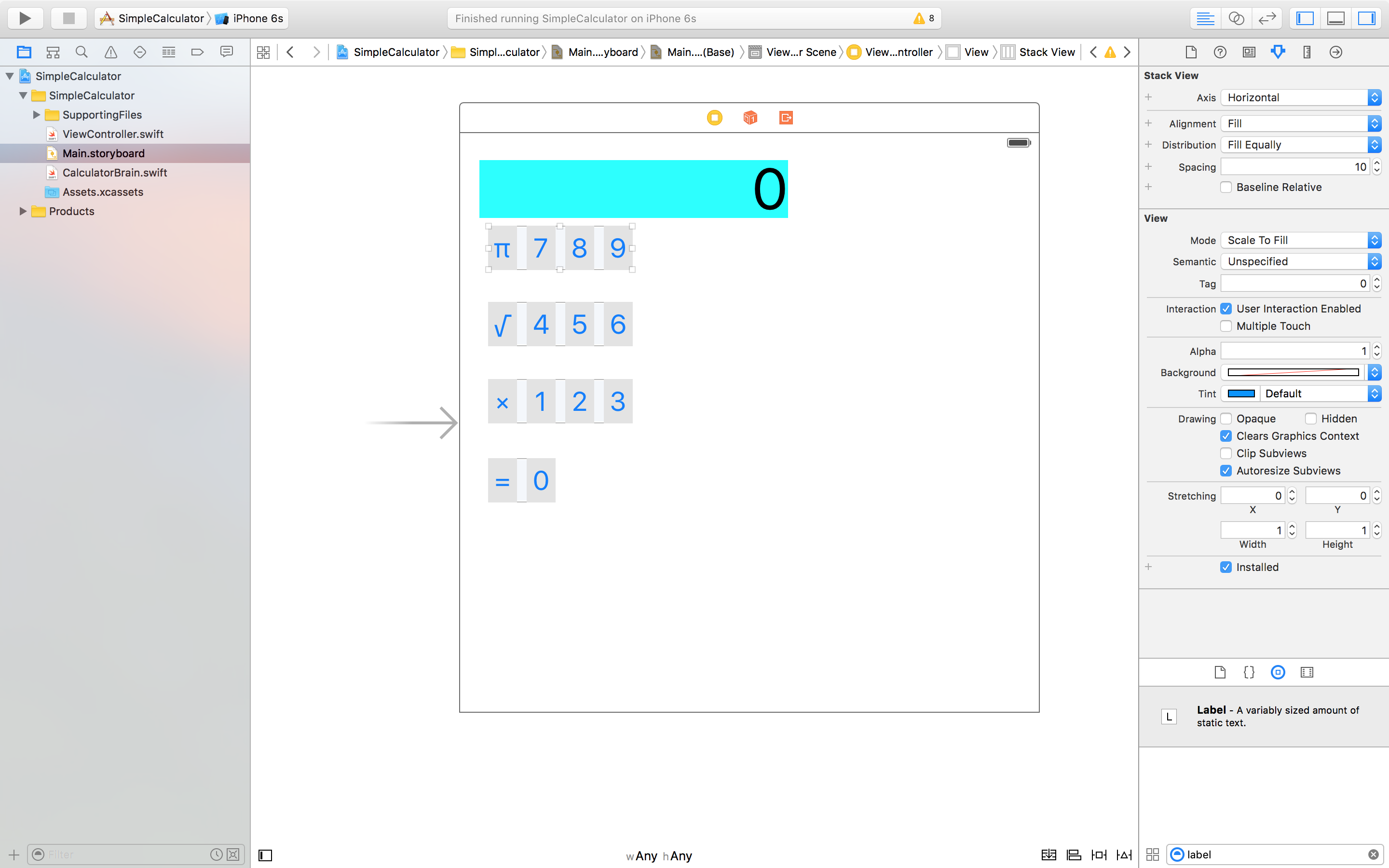 Figure 3: Horizontal Stacks of buttons.
Let's create a vertical stack of stacks for these stacks that we have just created. This can be done similarly by selecting all the stacks and then creating a stack view as before. Xcode should realise that you are creating a vertical stack and the axis property should already be set to vertical. You can set the spacing property to 10, to separate the each of the rows inside this stack. The distribution property should also be set to "Fill Equally" so that the height's of each row are equal. However, the alignment property should be set to "Fill". This essentially means that the UI elements naturally fill up the space. The best way to truly understand each property is by trying it out.
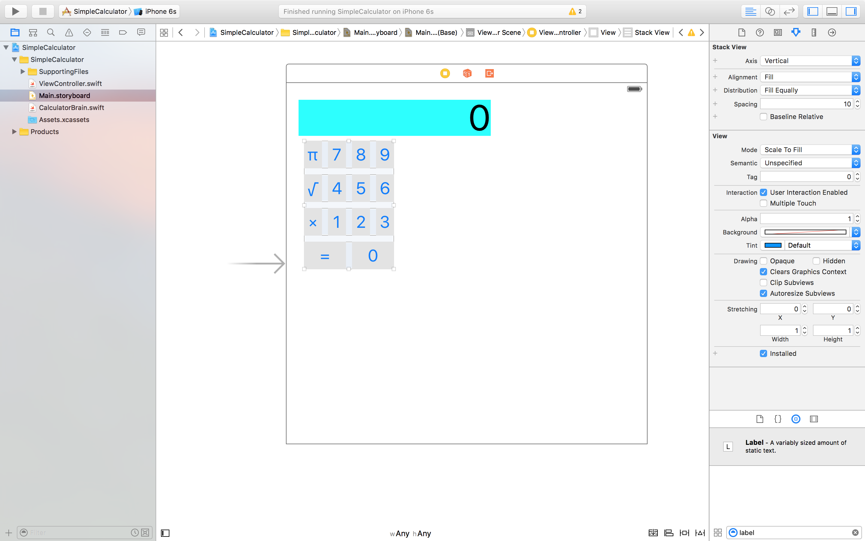 Figure 4: Vertical stack of stacks.
We will now create our last stack which combines the display with the vertical stack to create another vertical stack. Again, it is recommended to play around with the properties to see what needs to be done. I made the spacing 10; remember this is the separation distance between the display and the vertical stack of buttons. The alignment property should be set to "Fill" instead of "Leading". The distribution should also be set to "Fill". By now you should have something that resembles that of a keypad. However, you should realise that we aren't done yet, as the storyboard illustrates, the keypad doesn't cover the whole view. We will sort this out now.
What we need to do is add constraints for this outermost stack with respect to the edges of the screen. To do this we are going to Ctrl-Click the already highlighted stack. Note: It's important that the correct 'stack' is highlighted, otherwise you would be constraining the wrong UIElement. By Ctrl-Clicking we should get the blue line to come up as we drag the mouse - just the case when we were creating actions and outlets. However, this time we will be dragging it to the edges of the storyboard. We need to do this four times, once per edge.
- Begin with the top edge, once you let go of the mouse you should get a set of options. We will go with "Vertical Spacing to Top Layout Guide". This will create a small ibeam above the keypad.
- For the right edge we want "Trailing spacing to container margin".
- Bottom edge: "Vertical spacing to Bottom Layout Guide".
- Left edge: "Leading space to container margin".
Now we can double click each ibeam, or single click and edit in the inspector, to adjust the numerical constraint value. It is recommended to use the standard value when available, or 0 if not. Note: By using these values, you may see the ibeam disappear. This is because the ibeam length is dictated by this value, so naturally it will look like it's disappeared when using these values. Again, you can play around with these values, but the way to see changes is by running the application again, though you maybe also able to tell on the look of the storyboard. At the end you should have something that looks like Figure 5.
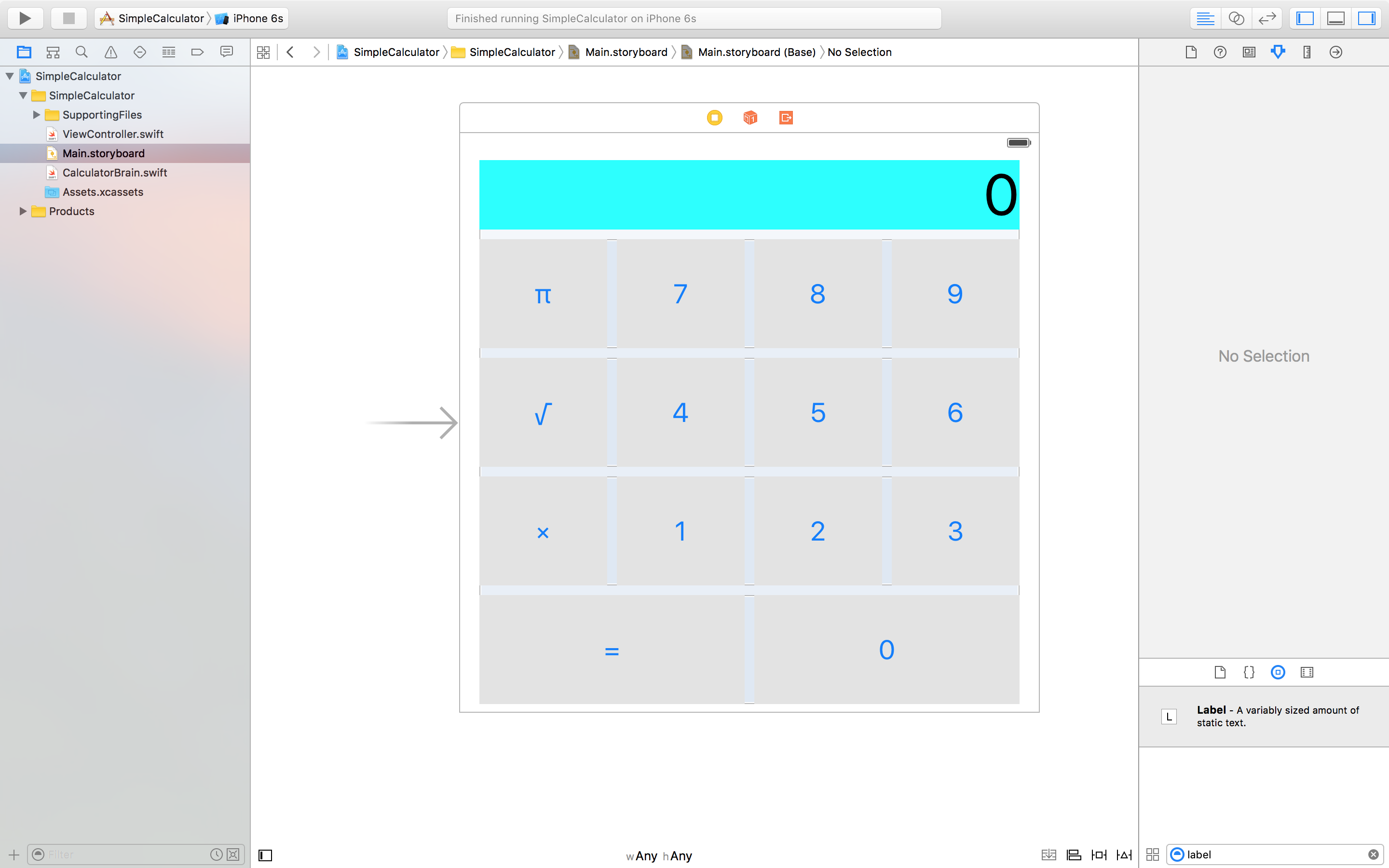 Figure 5: Complete UI design using stacks.
Now would be a good time to test out your application, especially in different orientations or devices. Tip: If you want to use the simulator, select it at the top where it will either say your device name or the default device. Then when you press the run button, it will automatically run the application in the device selected. If something goes wrong when you are testing, particularly in portrait mode, then you may have selected the incorrect properties for your stack view. You can modify them by clicking on the appropriate stack view and editing it in the inspector pane. Tip: You can Ctrl-Shift-Click to select the appropriate stack view.
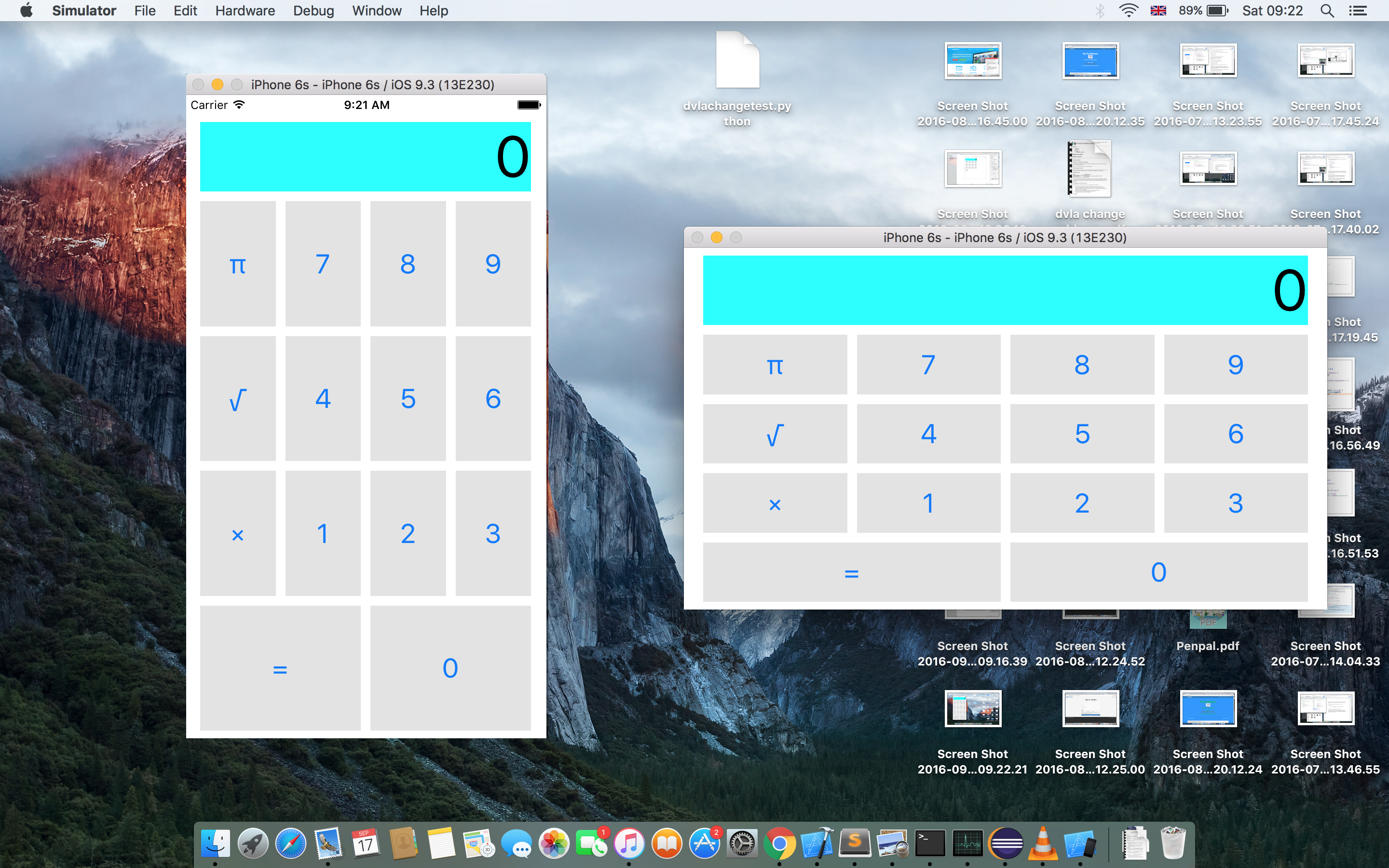 Figure 6: Portrait and landscape orientations.
This will be a short post, because it may take some time getting used to these properties. I also encourage you to play around with the properties, and break the design of the UI on purpose. Notice how we didn't write any code for this section.