Notes:
- Writing this series would not be possible without the resources provided by Stanford University.
- I have already had a look at iOS development by myself during my time at Stanford University in the Silicon Valley Innovation Program. However, it is in my interest to go over things in more detail, especially for Swift being a new language with not a lot of resources out there. Writing these posts is my way of learning and sharing my thoughts in the process.
What is Swift?
Swift is a new programming language created by Apple Inc and publicly announced at WWDC 2014. It took the best features from popular programming languages to create one "super-language".
Now I can build anything with Swift from a social media application all the way up to a high performance 3D game using Metal ~ Chris Lattner (First developer of Swift)
Getting Ready...
You need to have a mac (or a virtual machine running macOS) and have Xcode installed from the AppStore. Note: The Xcode download is around 3GB so make sure to have a steady and reliable internet connection throughout. For reference at the time of writing I had Xcode v7.3.1 installed.
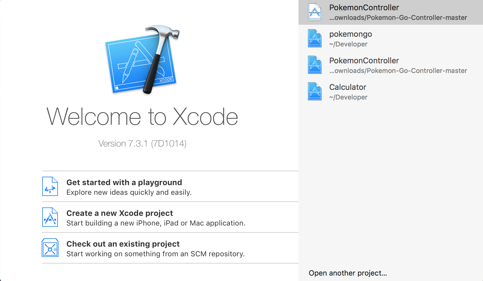
Once you are ready we can begin creating our first application, which will be a simple calculator. When you open up Xcode you are presented with a small window split into two panes see Figure 1. The left hand side has three options for "starting" a new project in Xcode, as opposed to the right hand side that simply shows recent projects.
There are three ways to begin a new project in Xcode:
- Get started with a playground: Code on the fly and quickly test/mock things up using the Swift language.
- Create a new Xcode project: You will probably doing this a lot as a beginner.
- Check out an existing project: If you find a project online that is using source code management e.g. GitHub, then this option makes it easier for you to import and start messing around with the code.
Creating our first project
Let's create a new Xcode project. You will be presented with a dialog box to select what kind of application you are developing. We are going to be creating an iOS single view application as this will present us with a minimal amount of starter code, allowing us to begin learning more easily.
- The next screen will then ask for some 'admin' information such as Product Name and Organization Identifier (this is what uniquely identifies you as a developer).
- You will need to select Swift as the language for development. If you have kept up with news on iOS development in the past, then you may have heard of the language Objective C, which was used before Swift was created to create iOS apps.
- You can also specify whether you would like to create the app for one particular device (iPhone or iPad) or both (universal).
- The next three checkboxes aren't necessary at this stage, but for those curious they relate to writing tests for the code you produce, and integrating with a database (that will store persistant information).
- Finally choose a place to store your project locally.
Once you have created your project, you will be presented with a screen that looks like this:
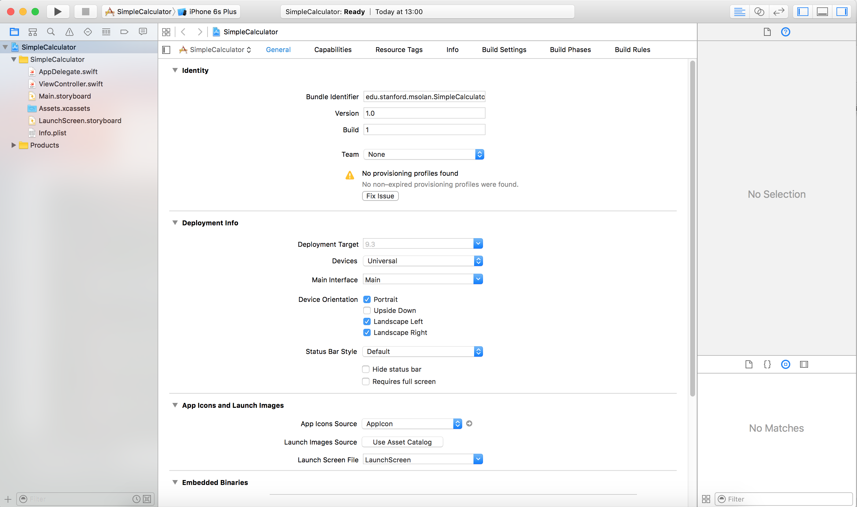 Figure 2: First project created.
Essentially we have three main sections.
- The left-hand pane is the navigator with several tabs to provide multiple ways of navigating your project.
- The middle is the main part of the window that shows you what you are focusing on e.g. it will display the code of a file that you have clicked on.
- The right-hand pane is called the inspector that allows you to view the properties of individual 'things' that you click on. It will also have a palette of UI elements for you to add to your project when applicable.
- In the top right corner you can see three icons together that allow you to show/hide the left-hand, right-hand and bottom panes.
- What's the bottom pane? Great question, this is the console/debugger that you will be using once we have an app up and running.
If you have some experience with programming, then one thing that is probably distracting your attention right now is the warning sign right at the center of the screen. How can there be a warning without me typing any code? Well, actually this warning has got nothing to do with your code, and we will sort it out now. Click on the dropdown option to select a 'team'. If this is your first time, then you may need to "Add an account". So go ahead and do this, by signing into your Apple id and following any trivial instructions that may pop up. Finally, click "fix issues" just below to finalise the setup - you may need to connect an Apple device to your computer via usb at this point. Tip: If you are having trouble, then make sure your device is selected at the top (in Figure 2 it currently says iPhone 6 Plus, which is a simulator, this needs to be your device). What we have done is essentially link the app to your Apple ID so that you can run it and test it on your own Apple products.
Let's now take a look at the starter code provided by Xcode. For now we will be focusing on two files: ViewController.swift and Main.storyboard. The other files can be moved to a new folder inside the current directory called SupportingFiles. Tip: Xcode calls this a Group as opposed to a Folder.
Break: Do you know what the MVC paradigm is?
Before we start taking a look at the code, it's important for you to get some understanding of MVC. The first time I encountered the concept was from a theoretical perspective that was put into practice by creating a calculator using Java. As you can probably guess, a calculator is a great example for getting your head around MVC from a basic viewpoint.
MVC stands for Model, View, Controller and is an important concept in Computer Science. In order to develop better applications, and also to make it easier for yourself, some languages focus on MVC such as Ruby on Rails and Swift. Trust me, once it clicks, you will truly appreciate the concept.
- Model: this is what the program does that is UI independent. For a calculator, the model will *do* the actual calculations.
- View: this is the user interface (buttons, textfields etc)
- Controller: all the communication between the model and view is done via the controller. It basically contains the logic of the application - if that even means anything to you.
Let's take a look at some code
Open up the ViewController.swift file, and let's see what we have got. As the name implies, this is the CONTROLLER in relation to MVC.
- import: the import statement is allowing you to reference methods and variables from a module, in this case UIKit, which is a module related to user interface elements.
- inheritance: this is implied by one character - a colon. In this case the ViewController class inherits from UIViewController. Note: Swift only allows for single inheritance.
- We have a few methods given to us, however for now we will ignore them by deleting it from the class.
Opening up Main.storyboard and you get a square diagram. As the name implies, this file will illustrate the look of your app, and so is essentially the VIEW part of MVC. Something that should cross your mind right now is that no iOS device is square shaped - at least in 2016. So why is our VIEW a square? This is a reminder that you aren't developing an app for a particular size device, and instead an app that can adjust suitably to the screen size. We'll soon see that placing UI elements in the correct place can be a tough task, and is not as simple as graphic design software.
With Main.storyboard open, let's add our first UI element. On the bottom right you should find the palette with UI elements we can drag and drop into the view. Remember if you do not see the right-hand side pane then you can 'show' it by clicking on the button at the top right. We can filter the elements by typing in what we want in the search box. Try and find a button and drag it into your view.
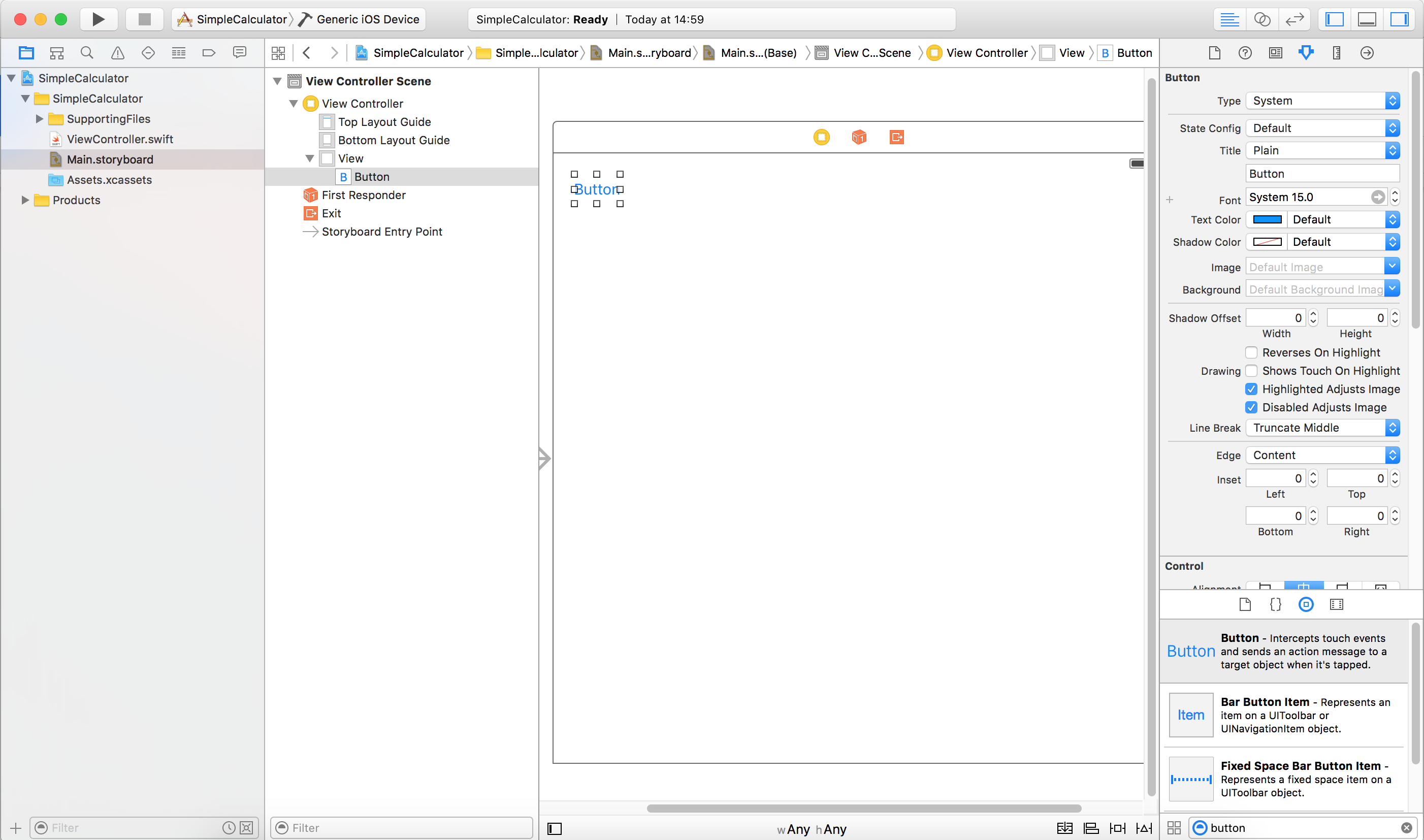 Figure 3: Adding our first UI element.
You may have noticed blue lines appearing when dragging the UI element into your view. These help with positioning relative to other elements. For now, it's ok to place the button wherever you want. Also take note of the inspector in the right hand side pane that allows you to modify the properties of the button. If you do not see this, then make sure you have clicked the 'button' on the view. Feel free to explore and try modifying the button such as text, font and color.
Note: This is also the time where you may notice that your resolution and screen real estate start to take a toll with all the panes open in Xcode. The middle pane has now divided in two, as seen in Figure 3. The left hand side of this middle pane contains a hierachical view of the storyboard, and is good for illustrating the structure once we have added and/or nested UI elements. You can show/hide this pane in the bottom left corner of the right side of the middle pane. The button looks similar to the ones on the top right of the screen.
Great we have added a button to our application, but it's yet to do anything. To add some functionality, we need to bring the controller and view up in a side by side view. We do this by clicking the 'venn diagram' button on the top right, next to the show/hide buttons for the individual panes. You may need to adjust what you see on the side by side view by clicking on the top of each side to show a list of files possible to view. You should end up with something like Figure 4.
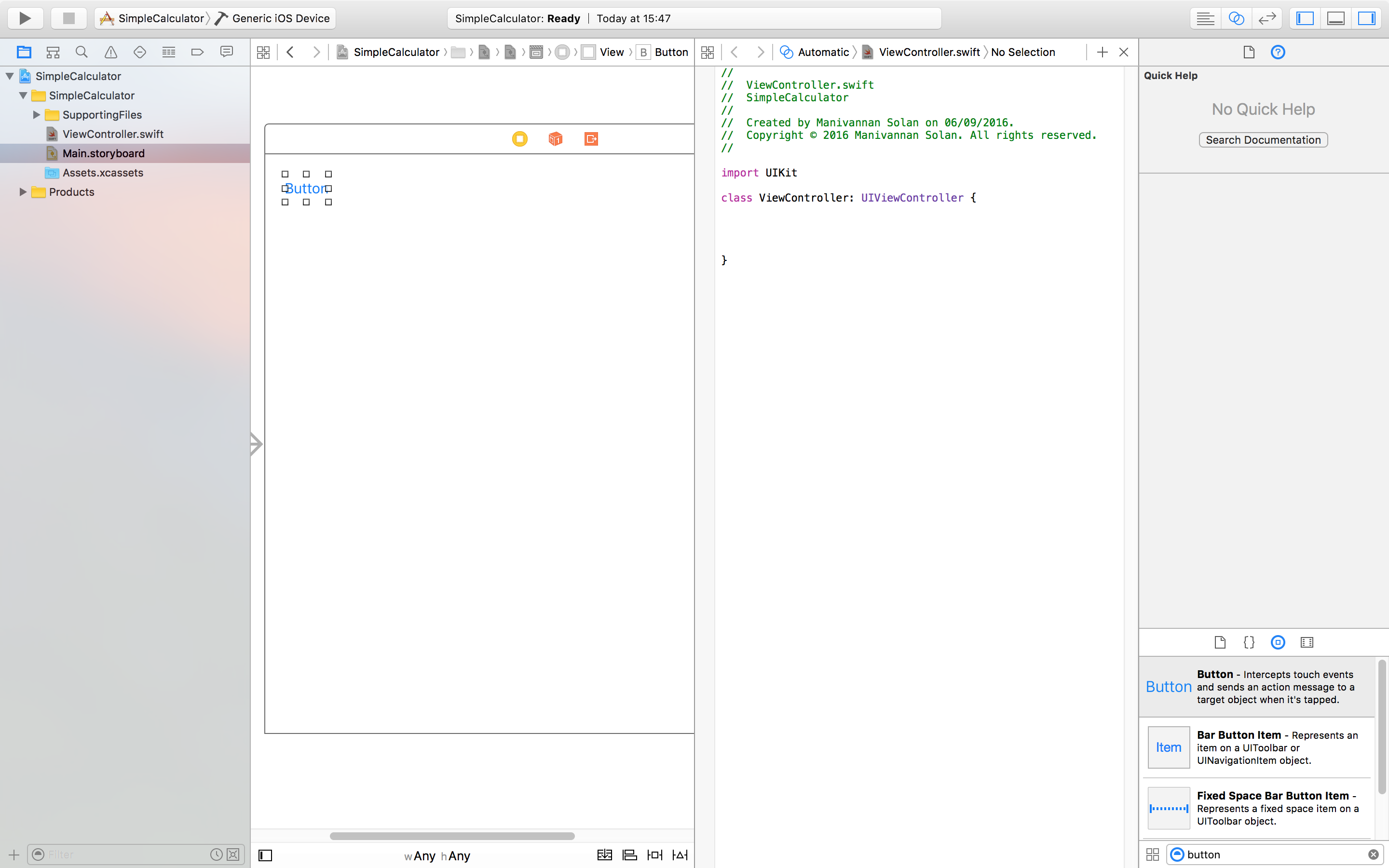 Figure 4: Side by side with view and controller showing.
If you have never seen iOS development using Swift, then this bit will seem really funky to you. I'm pretty sure it wasn't part of Objective-C, but I may be wrong. In order to have 'link' the button to the controller, you need to press Control, and click and drag the 'button' from the storyboard to the controller. A blue line should be visible during the drag. You should then get a popup similar to Figure 5.
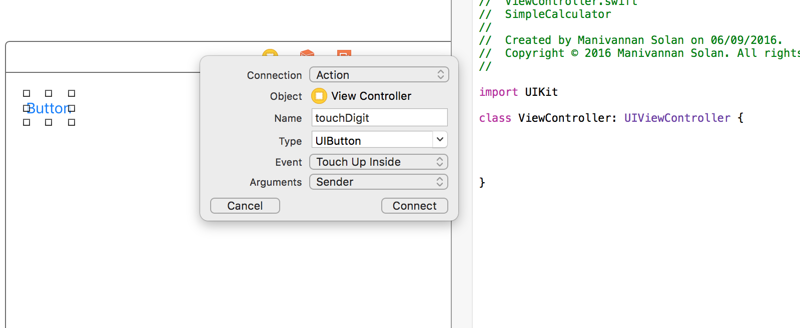 Figure 5: Creating an action for a button.
We want to create an action for this button. This basically means a method to be called when something happens to the button - in this case it being touched inside. We will call the action 'touchDigit' and select the type to be UIButton, and pass the button itself as an argument so that we can access it inside the method touchDigit that will be created in the controller. This will create an empty method in the controller that is ready for code to be added to it. You may also note a 'target' symbol in the grey column to the left of the method. Hovering over this 'target' will show buttons that are linked to the method.
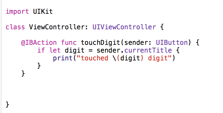
Take a look at the Swift syntax for a function definition. Note: The @IBAction is *not* Swift syntax and is part of Xcode. The most important thing here to note is how the type of an argument is illsutrated. The argument 'sender' is said to have a type of UIButton using the colon to distinguish this. Let's add some code to try and find what the text of the button is and print it to the console. See Figure 6.
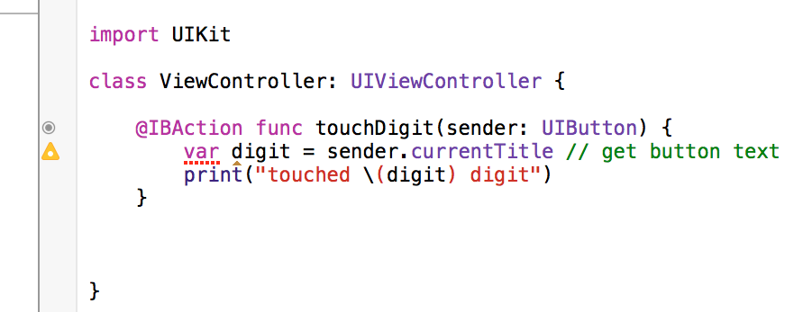 Figure 6: Writing our first swift code.
You may notice a warning appear, we will talk about that. For now get a feel for the syntax for creating variables and printing formatted output to the console. Of course, being new to Swift you wouldn't have known that currentTitle is the way to get the text of a button. You can try and find what you're looking for by alt clicking on a class e.g. 'UIButton' found in the arguments list of the function. This will bring up the documentation where you can find all the information you need. Also before moving on, Swift uses inferred typing, which means that you do not have to explicitly type your variables and constants.
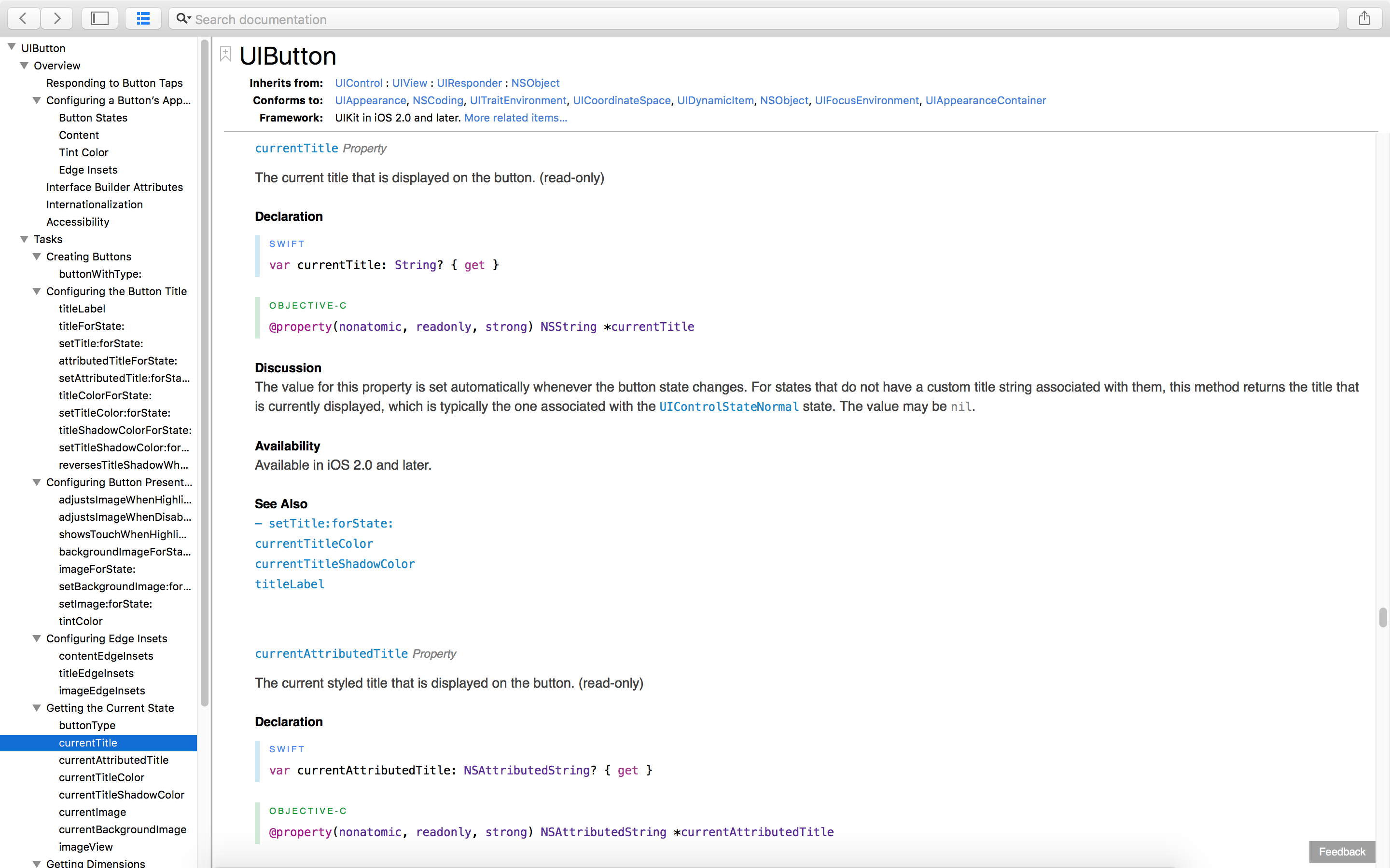 Figure 7: UIButton Documentation.
There are two things to note about currentTitle in the documentation. It is a read-only property - identified by the { get } in the documentation. The type of currentTitle is String?, yes String? - read out loud as String Optional. Optional itself is a type and it's either set (then it has an associated value) or not. In this case, the button may or may not have text in it. We will talk more about Optionals throughout this series. For now, this is enough to have a basic idea.
Back to the warning... Clicking on the warning will tell you that the variable isn't changing throughout the code you have written and so it should be changed to a constant using the 'let' keyword. Go ahead and do this by replacing 'var' with 'let'.
At this stage it is possible to run your simple application with one button to make sure everything we've done so far is working. You can choose to run the application on your device, or on a simulator by choosing the appropriate one at the top of Xcode. You can run the application by clicking the 'play' button to the far left of that. See Figure 8.
 Figure 8: Running your application.
Now you should see your application load on either your device or simulator (depending on which one you have selected). The button should show up, and when you click on it nothing should appear to change in the application. Instead, you should see the bottom pane of Xcode popup and something printed on the console.
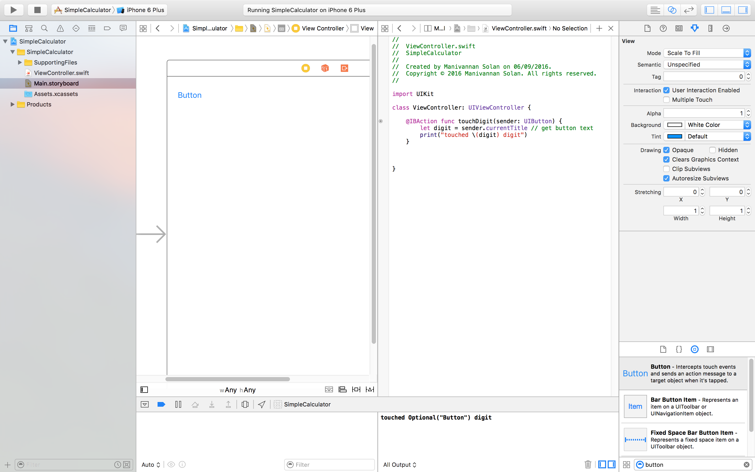 Figure 9: Console with printed output.
Everything seems to be OK apart from the "Optional" being printed in the output. Why is this? Well you probably didn't realise this was going to happen because of Swift's inferred typing. If we alt-click the constant digit in the method, then a popup should appear telling us that the type is String?. However, we just require the String - we don't really care if it's optional or not. The use of optional is for safety so that we don't have to play the guessing game on whether the string is empty, null or something else when it isn't set. To make the type of 'digit' String we need to unwrap the optional, and we do that using an '!' on the end of the line. However, forcing an unwrap of an optional that does not exist will lead to an error. we can fix this by including the unwrap statement inside an 'if' conditional statement. You should now have code similar to Figure 10, and running the application now will lead to more readable messages on the console. Note: By putting this code inside a conditional, we do not have to force the unwrap with an exclamation mark. If you read the code out loud, then it kind of makes sense...
Exercise: Delete the text inside the button in Xcode. You can do this by either double clicking the 'button' or single clicking the 'button' and editing the title of the button in the inspector. Remove the 'if' conditional statement around the line of code. Run the application, you will not see a button visible, however, click on where it would normally appear. The console should display a fatal error message. See Figure 11 for help if you get stuck.
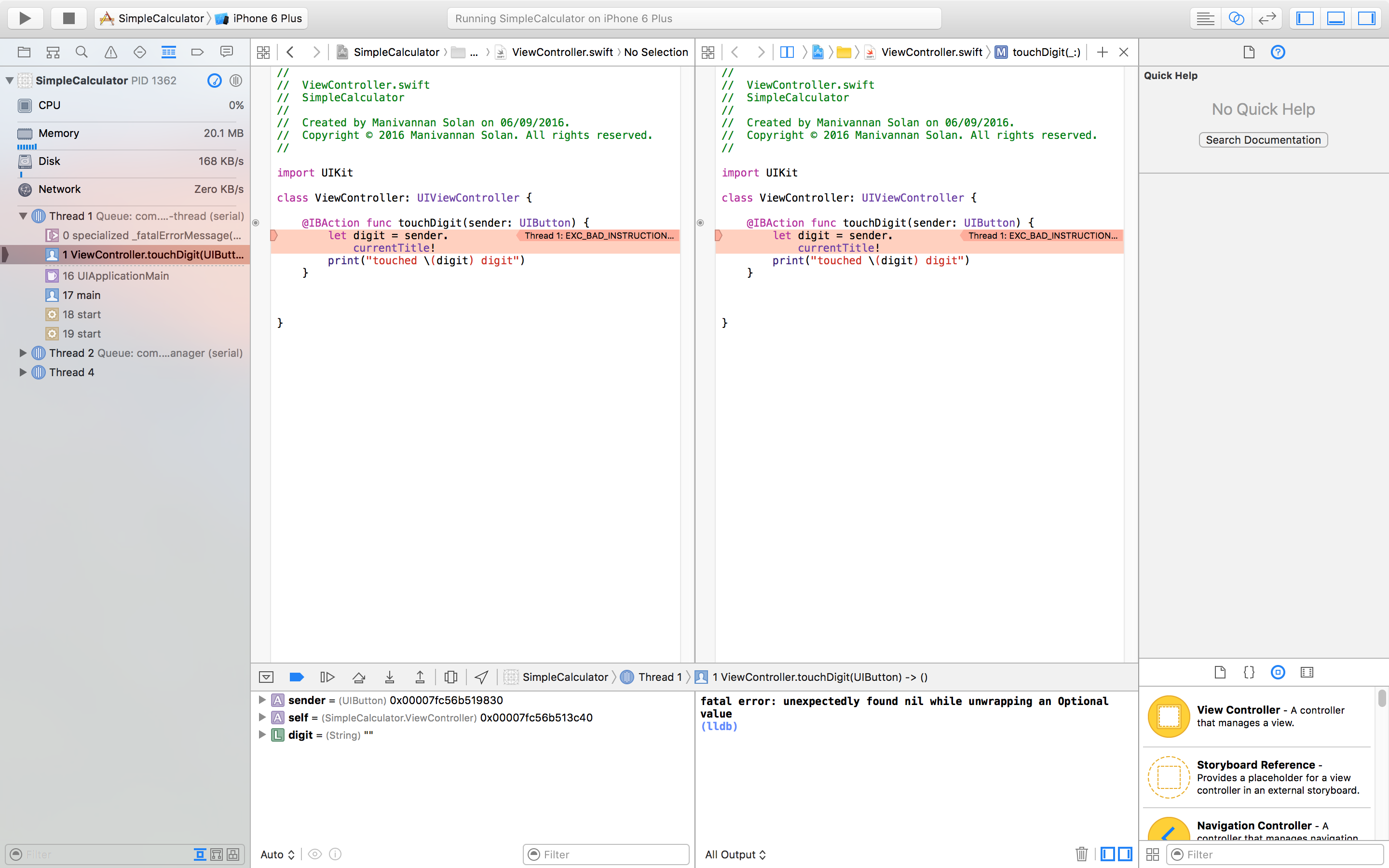 Figure 11: Exercise - Fatal Errors.
Adding a display for our calculator:
To add a dislay to our application, we simply have to drag 'label' UI element from the palette in the bottom right of the screen - just as we did for adding a button to our application. As before, we need to have access to this display in the controller. Make sure you have a split screen between the ViewController.swift and Main.storyboard (the venn diagram button). Then like before we are going to ctrl-click the label in the storyboard and drag the mouse over to the controller (make sure you drag to above the function toughDigit). However, instead of creating an action, this time we are going to create an outlet. Refer to Figure 12.
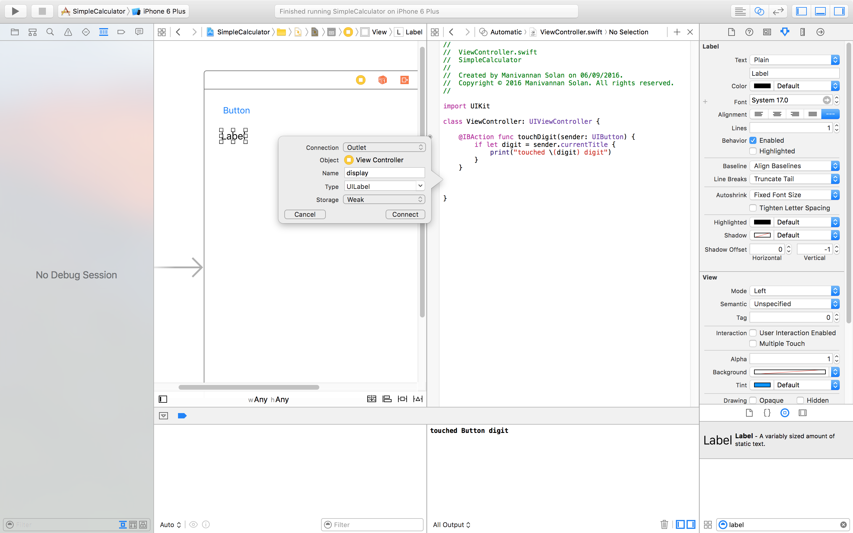 Figure 12: Creating an outlet.
This will create a PROPERTY, a new word for something programmers have already seen. These are basically variables or constants that are stored in a class, structure or enumeration and have getter/setter methods. This is why we dragged to above the toughDigit function - so that our properties exist above functions in the class.
What is the type of 'display'? It's UILabel! - what does this mean? Well the best way to get you're head around this is to replace the exclamation mark for a question mark on the end for now. Both pieces of punctuation are used for denoting optionals. At this point it would be good to make some modifications to the storyboard, if you haven't already done so.
- Move the label above the button in the storyboard.
- Change the text inside the label to '0'.
- Change the text inside the button to '1'.
- Make the text in the display right-justified
- Increase the width of the display so that when digits are appended we can see all of them.
- Optional: You may want to make the display large - increas the font size, change the background color etc
Let's now add some code so that when you click digits on the calculator the values get appended to the display. We need to find the current value in the display - try and figure this out without looking at the code below. Remember to take care of unwrapping optionals! It is similar to getting the digit of the button. However, we need to distinguish between when the user is still typing a value and when she is typing in a new value. To do this we need a boolean variable in this class that keeps track of this. This will give us two cases: 1) append digits to the current display value or 2) change the display value to the digit.
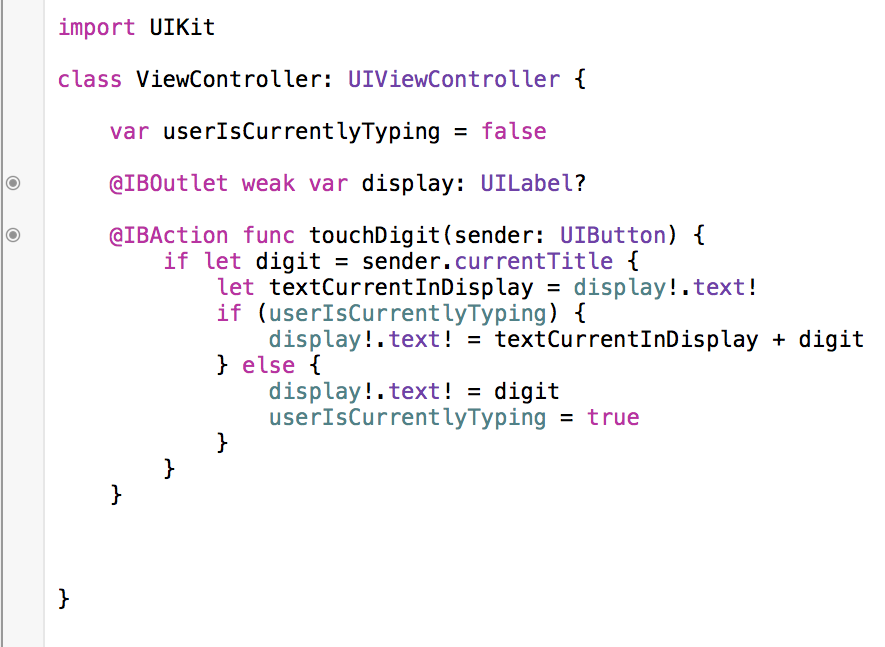 Figure 13: Adding code to update display of calculator.
Ok, let's discuss that moment where we replaced the exclamation mark with a question mark in the declaration of the display property. Did you (or do you now) find it cumbersome to write display!.text! everytime you wanted to access the display's text value? Well great if you did, and if you didn't - remember programming is always trying to be designed to make it easier for developers. And Swift being one of the more modern languages should be the one that clearly depicts such things. The code does make sense right now, from what we have learnt so far - we need to unwrap optional items. In this case, the display is optional because it will not 'exist' for a split nanosecond when the application is loading all the UI components.
So by including an exclamation mark instead of a question mark in the declaration of the display property, we are doing the unwrap of the display before using it in every other line of code to follow. Even though this is prone to breaking because we are *forcing* the unwrap, it's fine because the display will only not exist for a split nanosecond. This one punctuation character replacement now prevents the need to continuously unwrap the display - so get rid of these three occurrences in the code. See Figure 14 for the newly updated code.
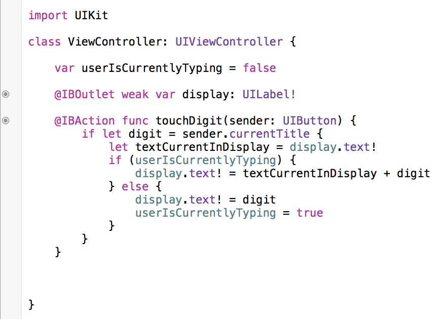 Figure 14: Updated code for unwrapped display property.
Go ahead and make some design changes to the storyboard, if you haven't already done so. Change font size, color, background colour, text-alignment etc for the button and display that you currently have. Next we are going to add the rest of the digits of the calculator. If you are thinking copy-and-paste, then you have the right idea. If we copy and paste the '1' button, then it automatically copies the associated methods (touchDigit). As a result, we do not have to do all the funky ctrl-click-drag that we did previously to add IBActions. In the end you should have something similar to Figure 15. Bare in mind, however, that these design changes are quite trivial, and we will get into more complex desiging later on - for example, adjusting UI components based on screen size and orientation.
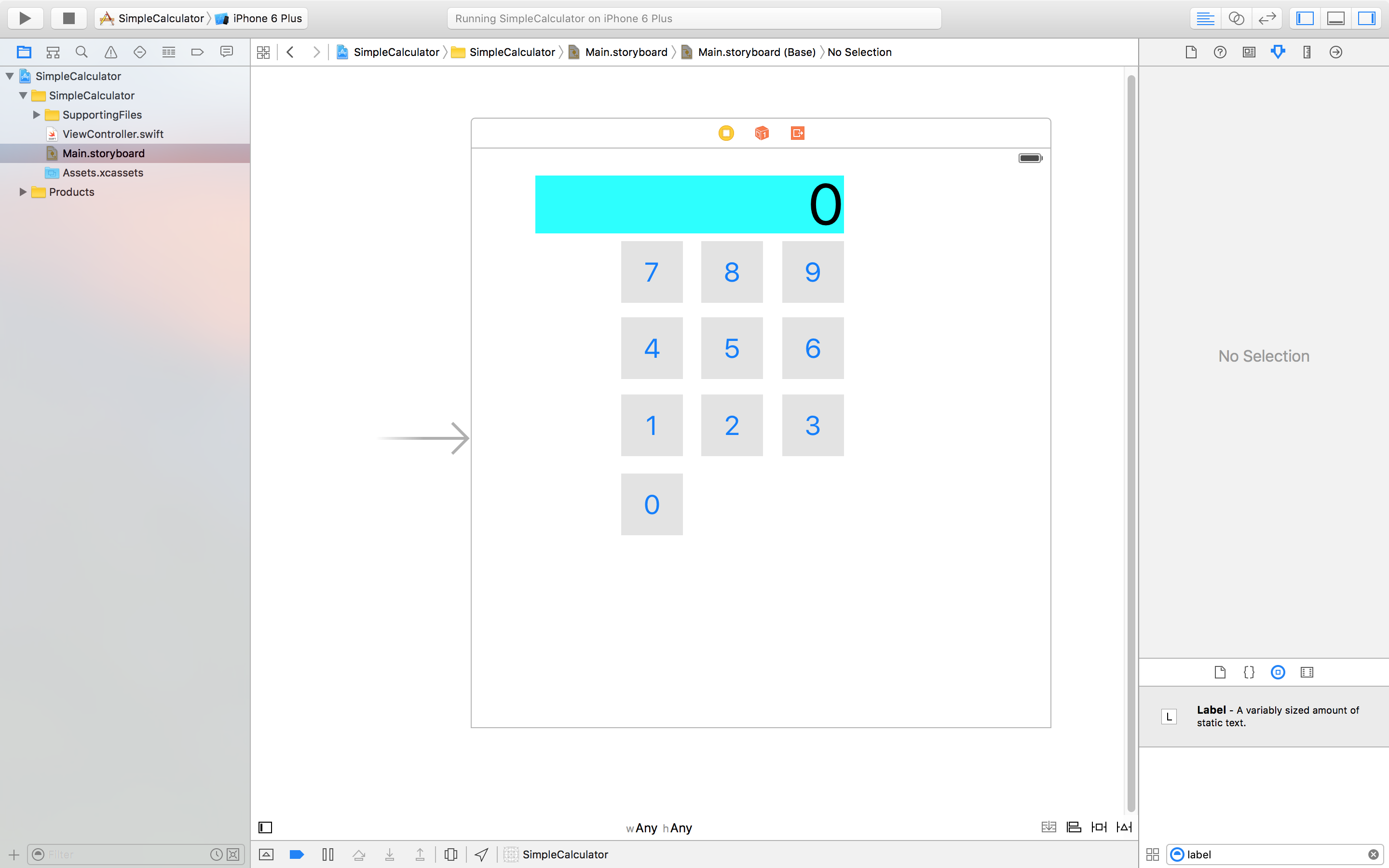 Figure 15: Example calculator design.
Tips:
- Have an explore, try different things - this is a good way to get a feel for Xcode and learn where things are.
- Don't spend too much time placing buttons in the right places - we will cover this soon in an easier way than doing it manually.
- To make sure the touchDigit function is indeed linked to all the digit buttons, in split screen view, hover over the target button towards the left of the touchDigit function. This should highlight all the buttons in the storyboard.
This was a pretty lengthy post, but hopefully it has got you up and running with Xcode. Some people like to put summaries down here, but I think that waste's reading time. Stay tuned for episode 2.
